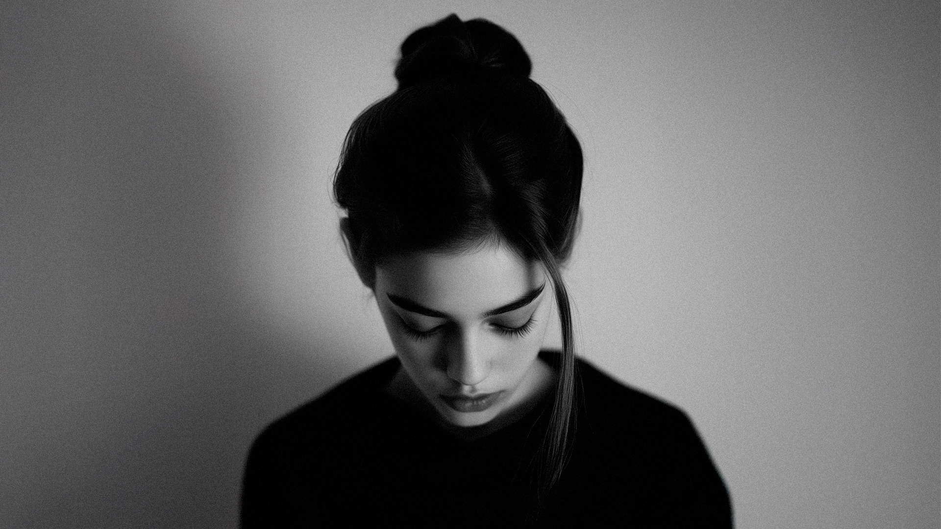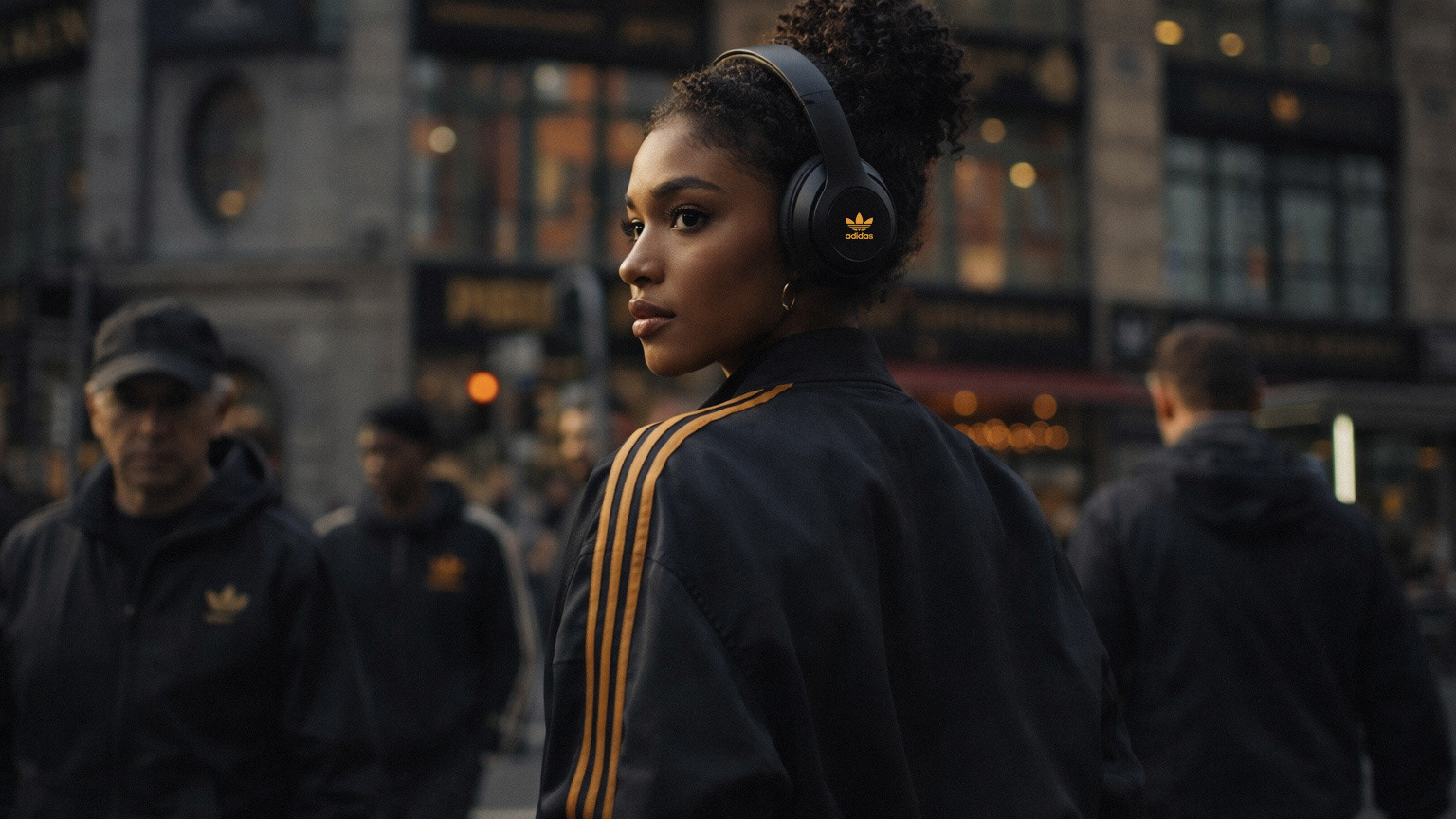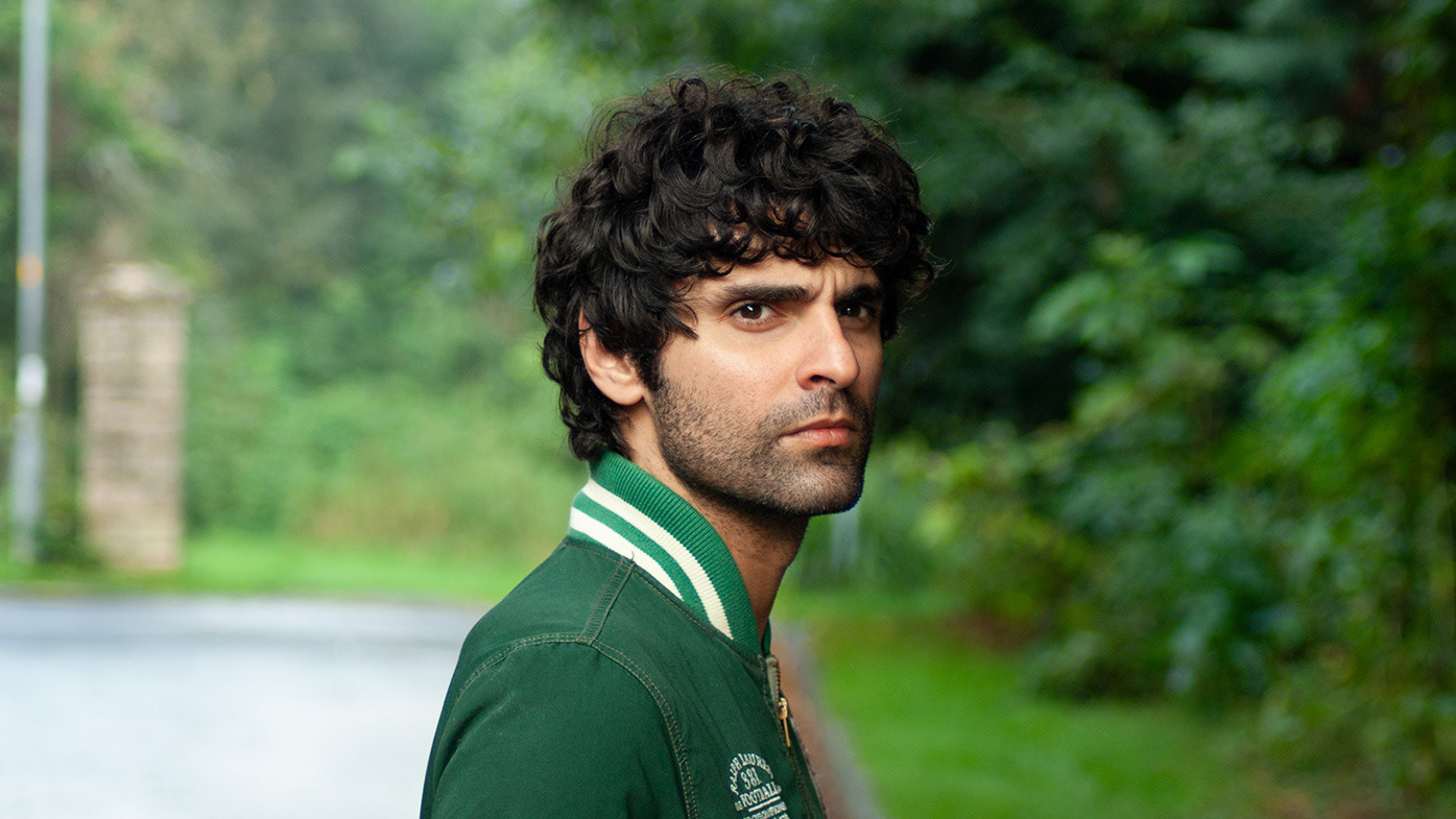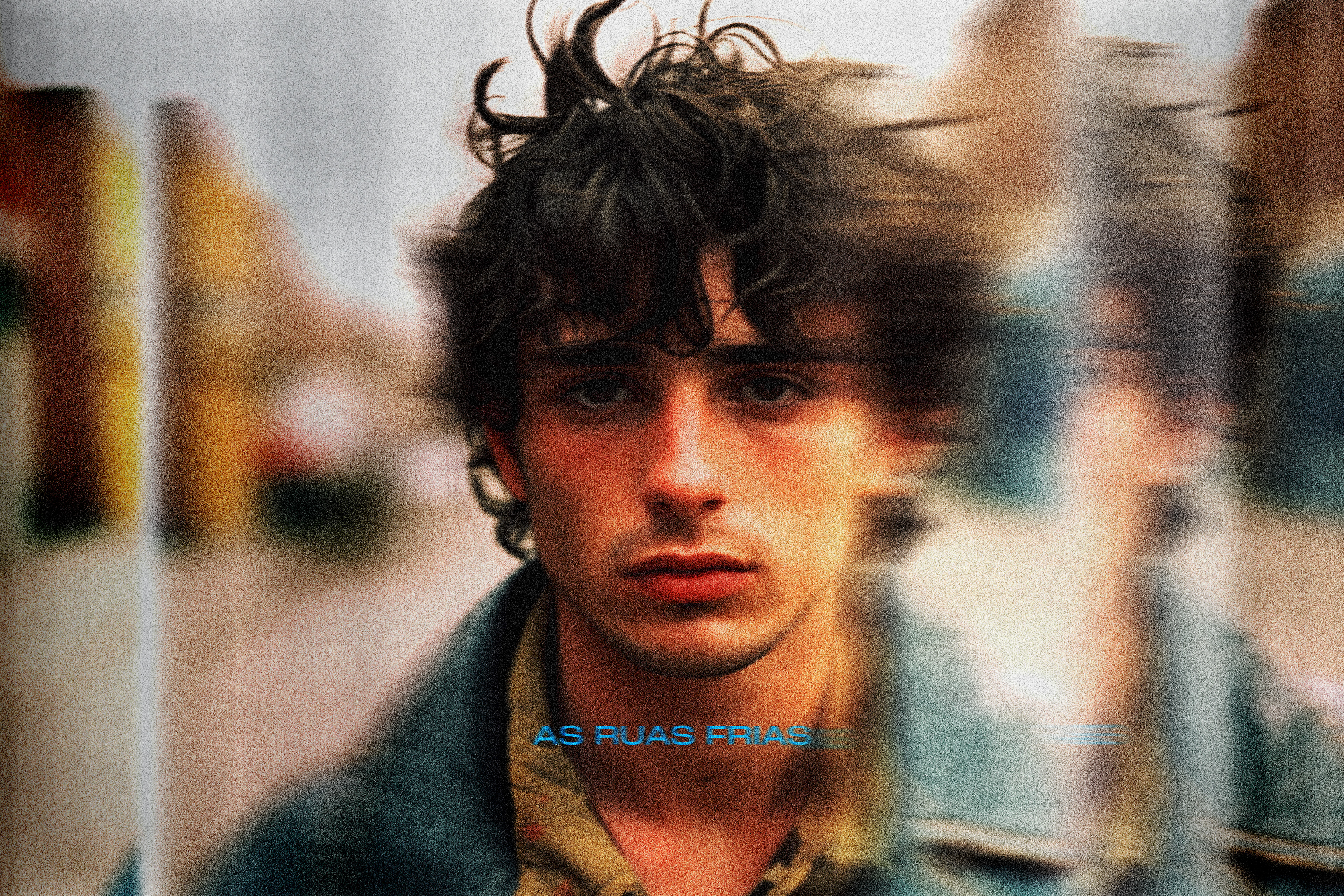
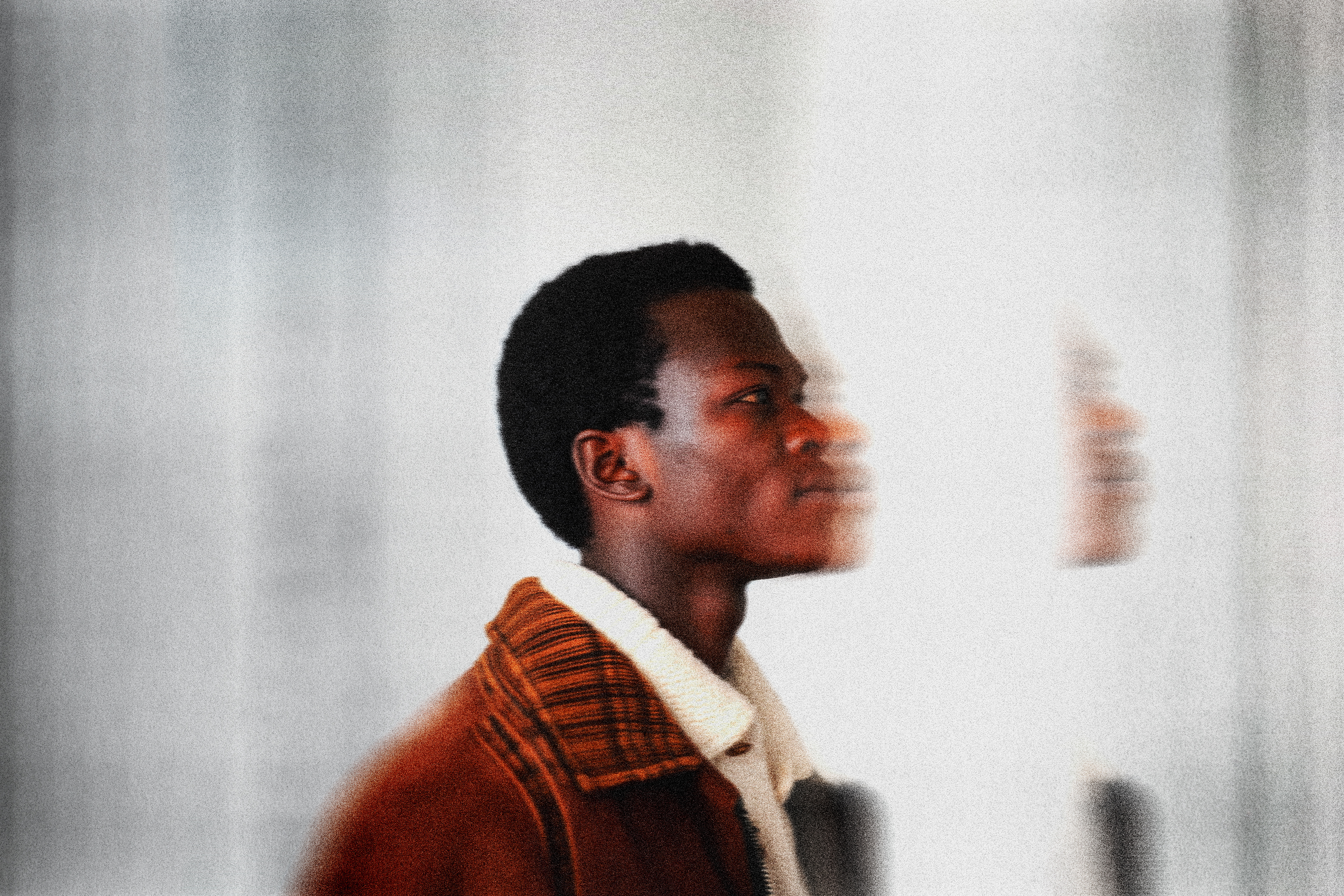
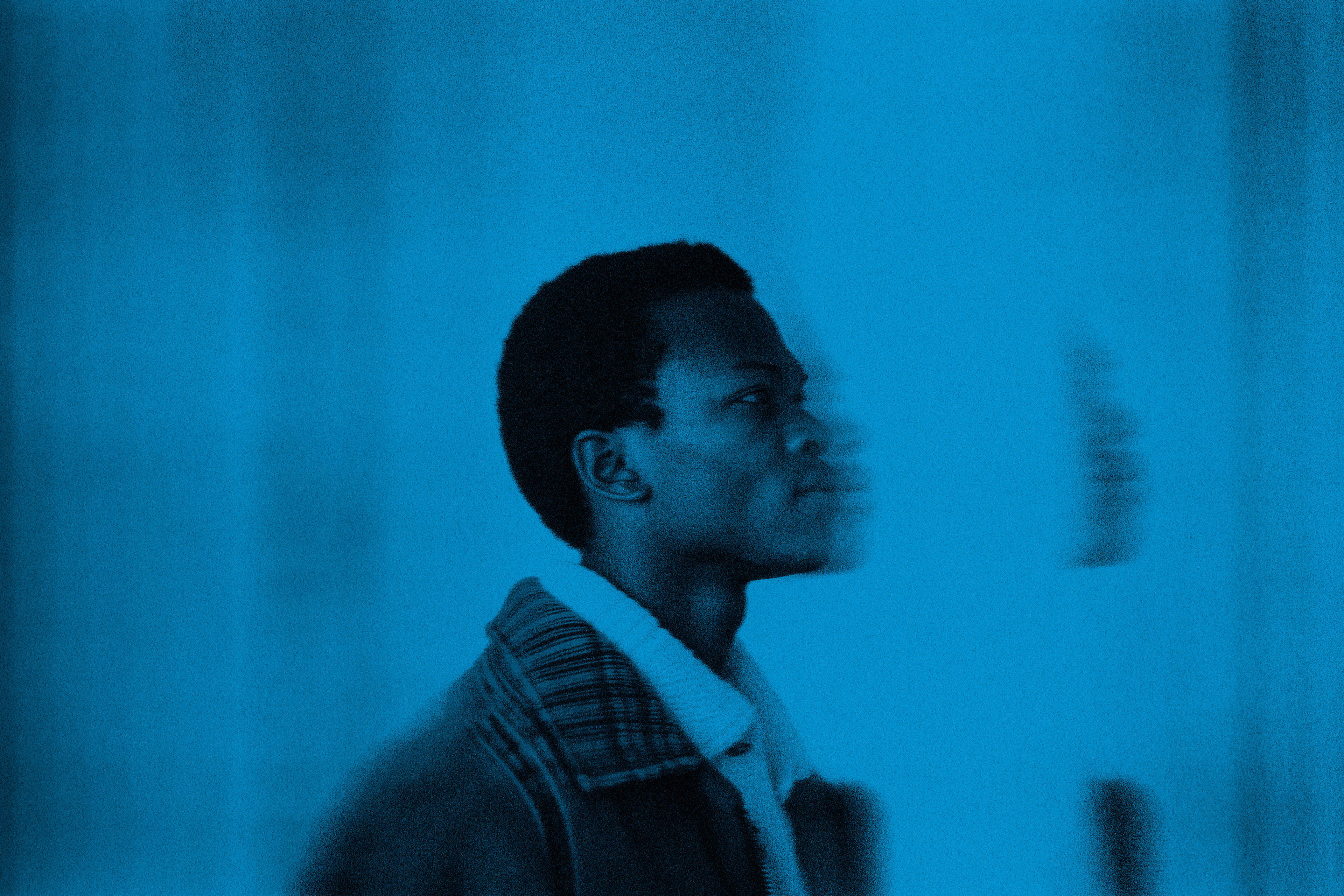
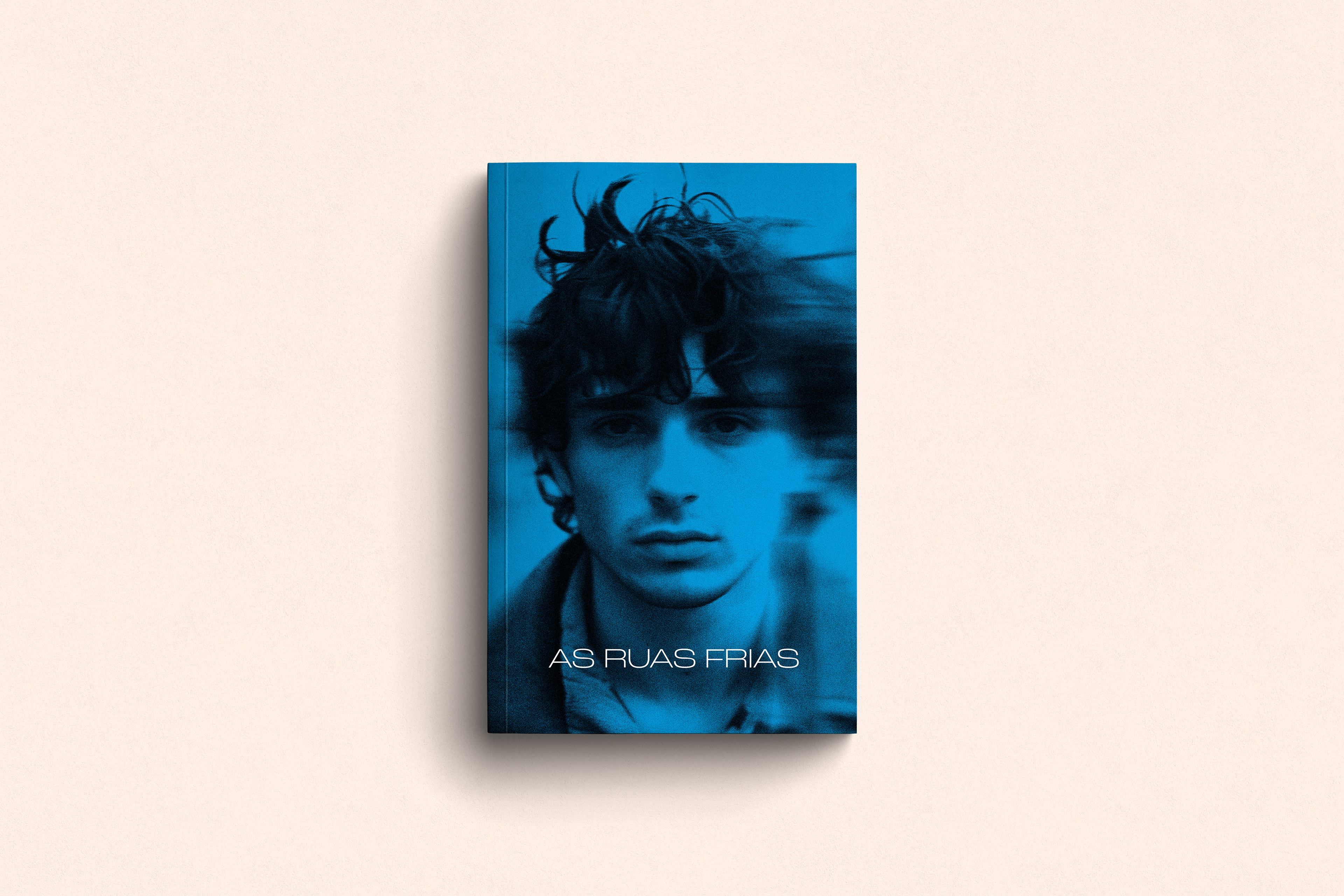
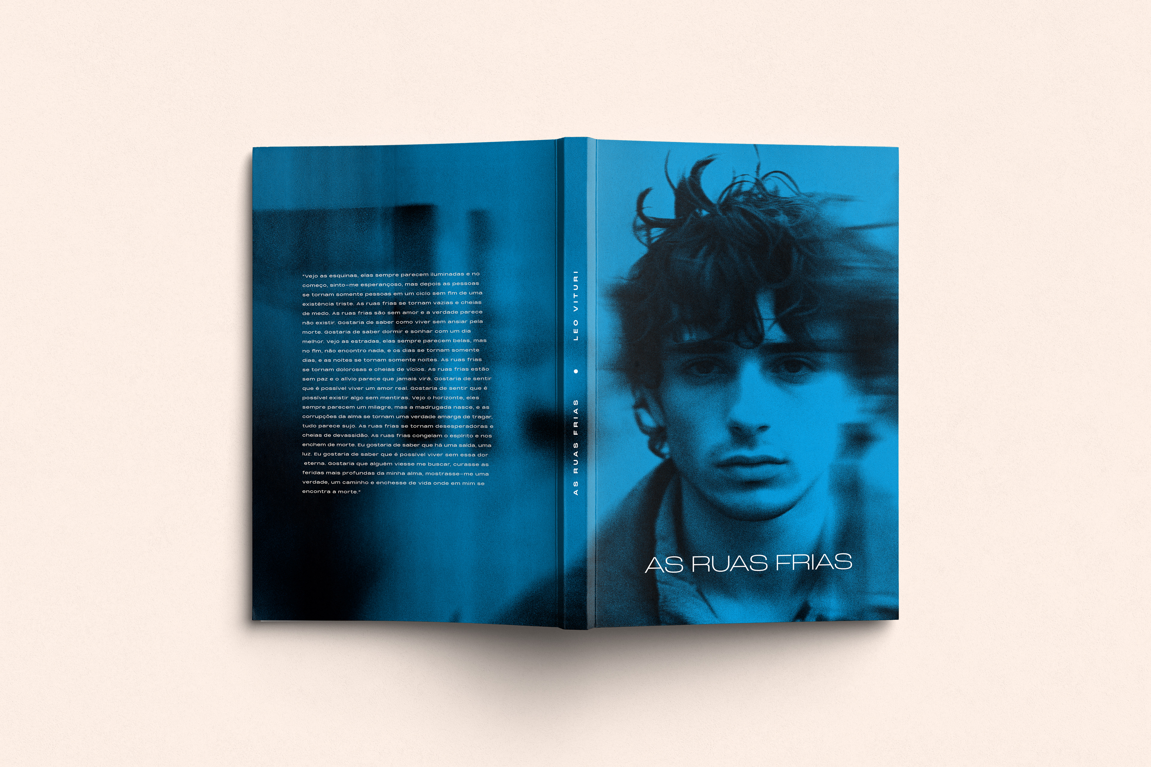
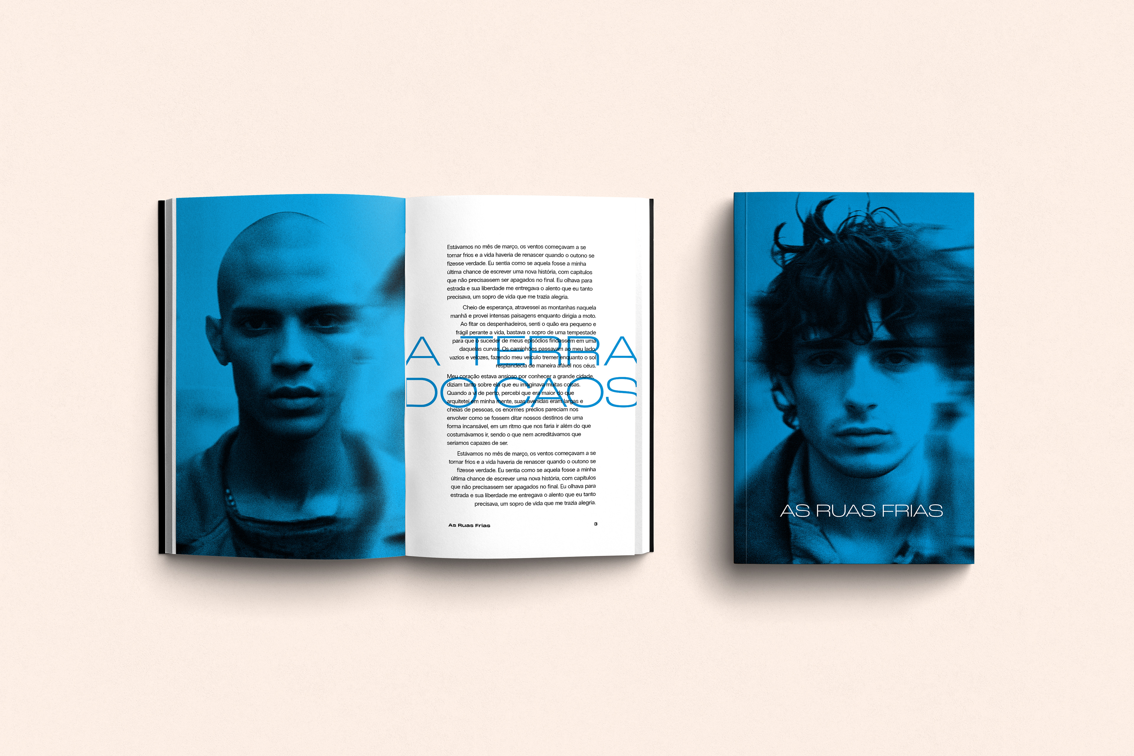
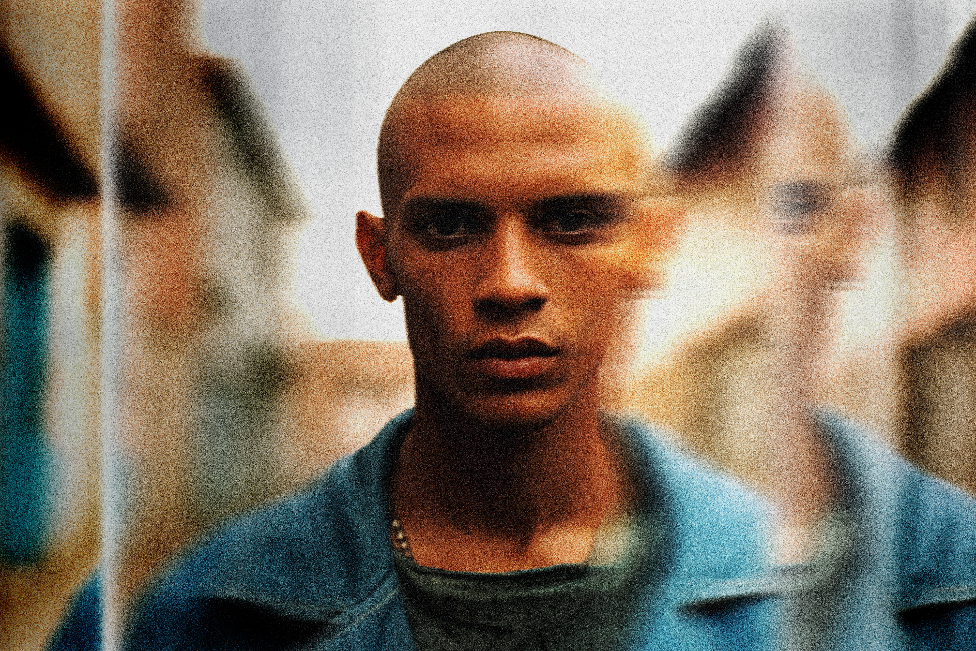
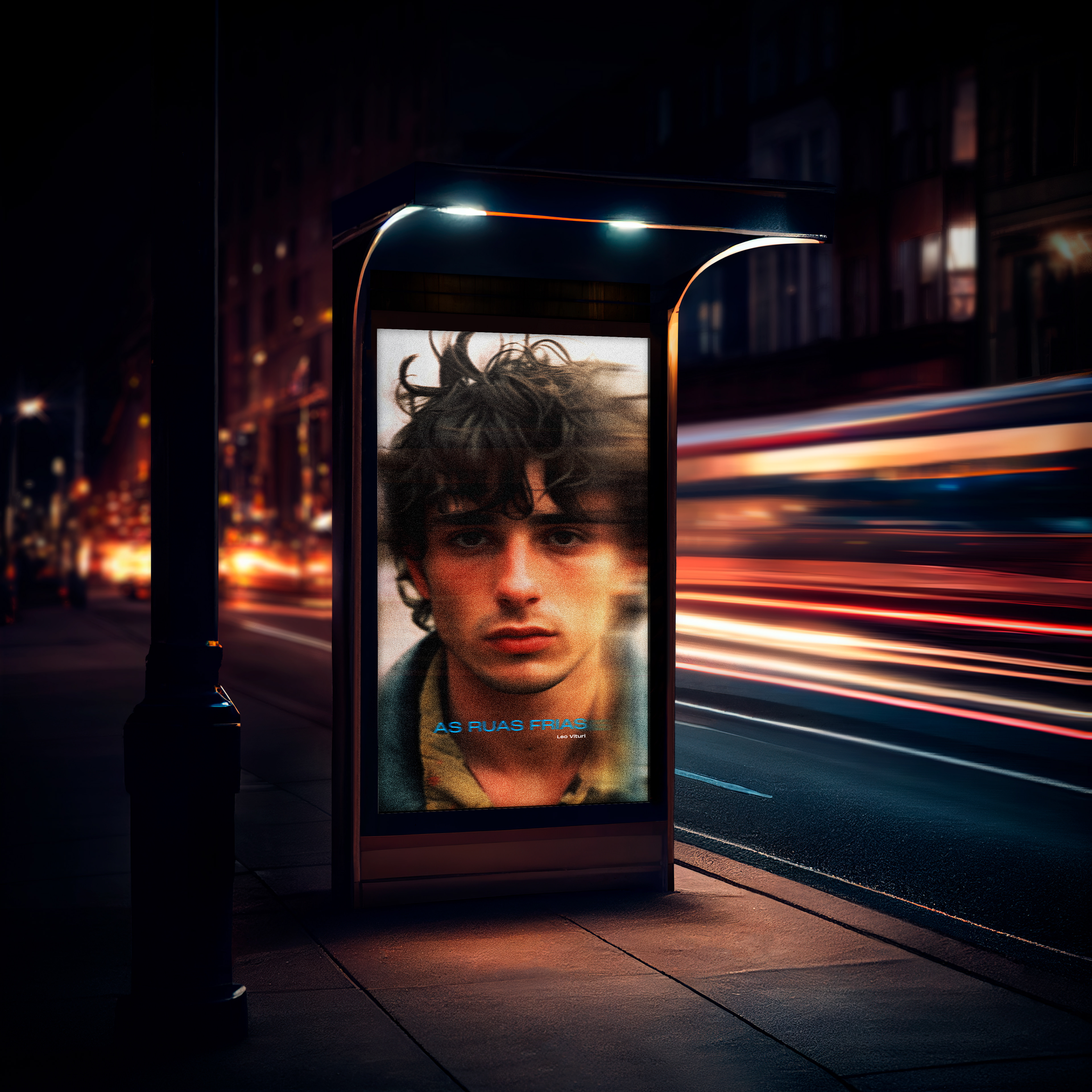
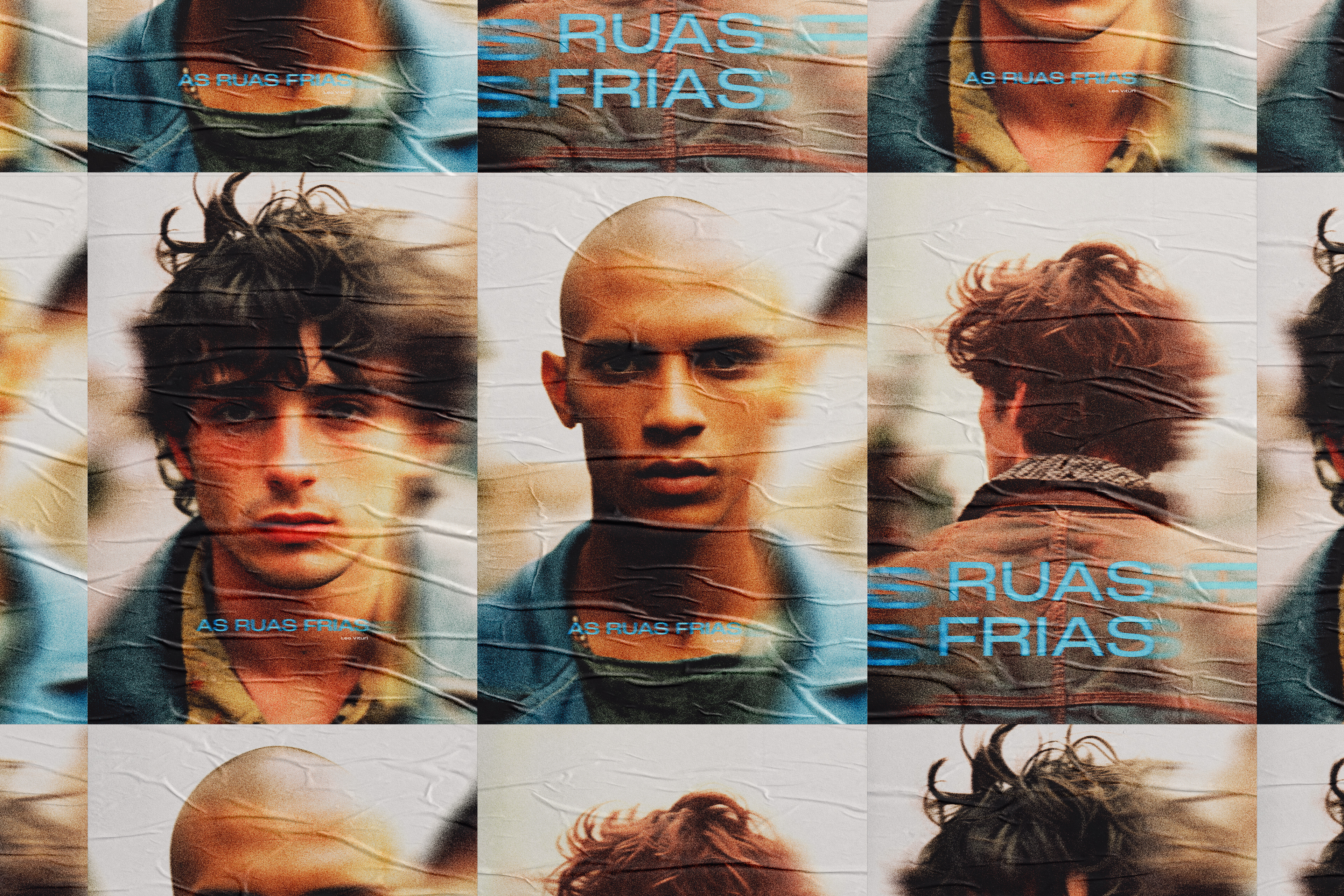
No livro "As Ruas Frias", as descrições físicas dos personagens são propositalmente limitadas, permitindo que eles sejam imaginados em diversas etnias e nacionalidades. Com isso em mente, o material gráfico da publicação e da divulgação do romance foi criado para refletir essa diversidade, abrindo espaço para uma representação ampla.
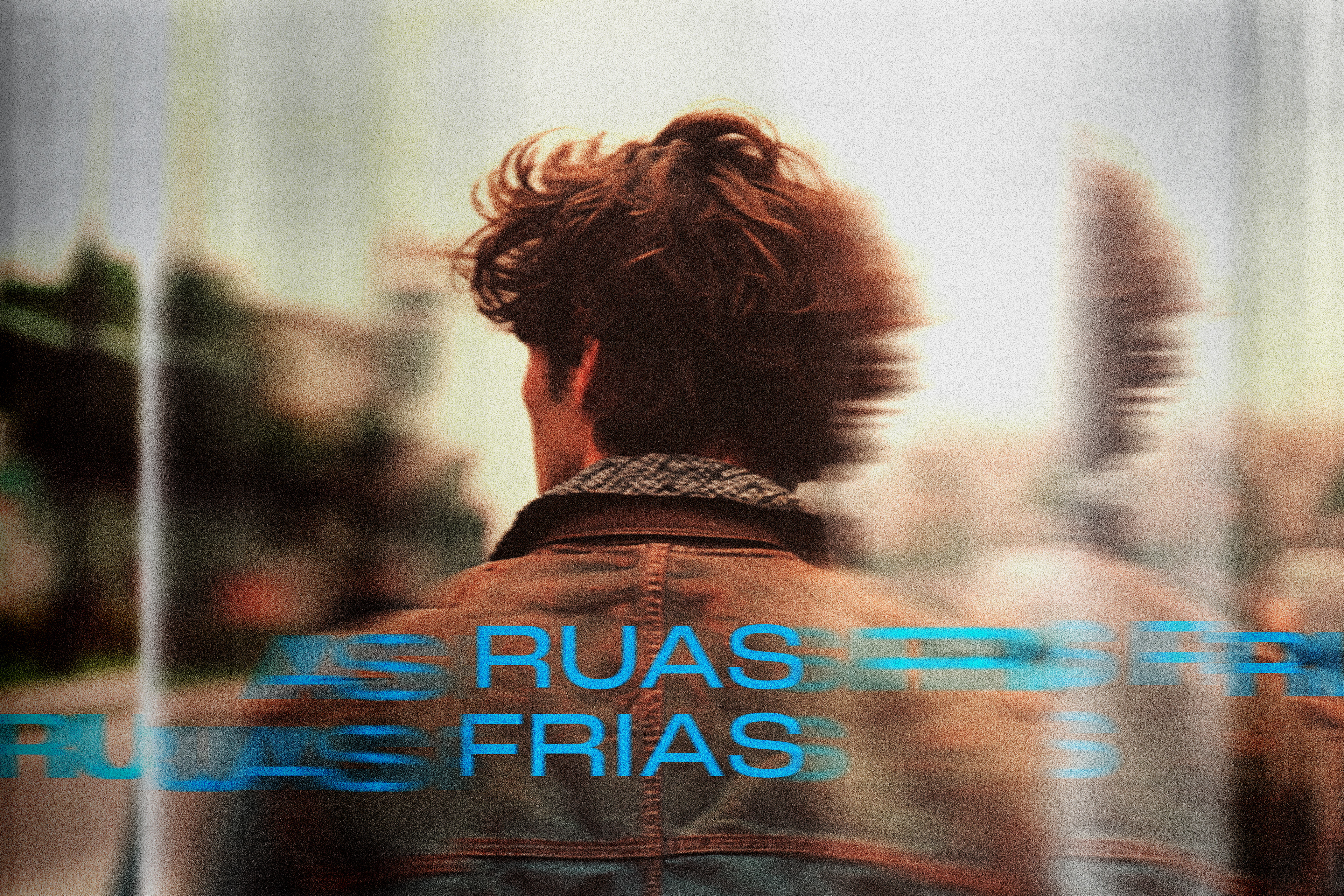
As imagens das personas foram geradas utilizando o Midjourney, uma ferramenta de inteligência artificial, e posteriormente ajustadas no Photoshop para alcançar a estética desejada.
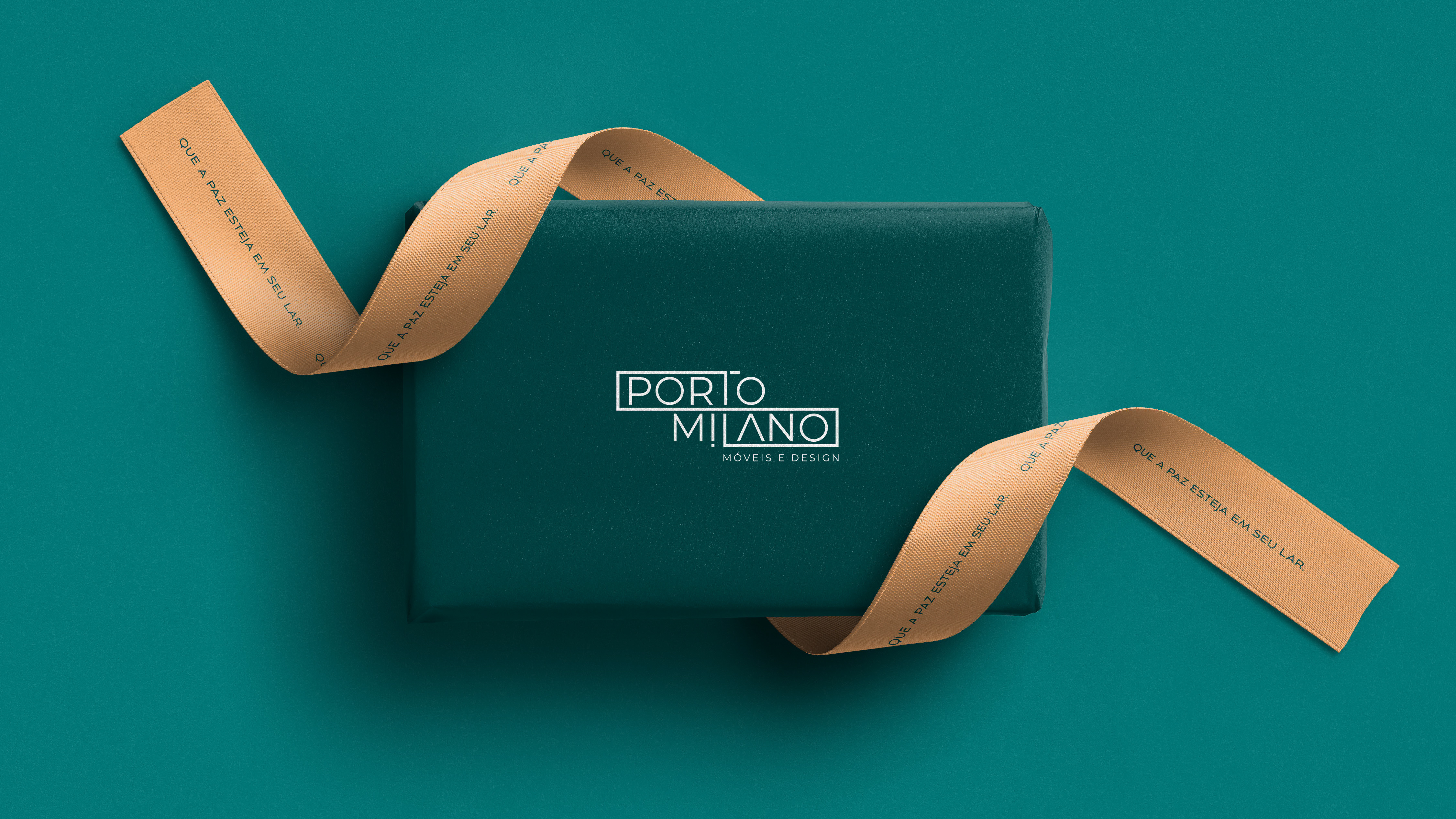
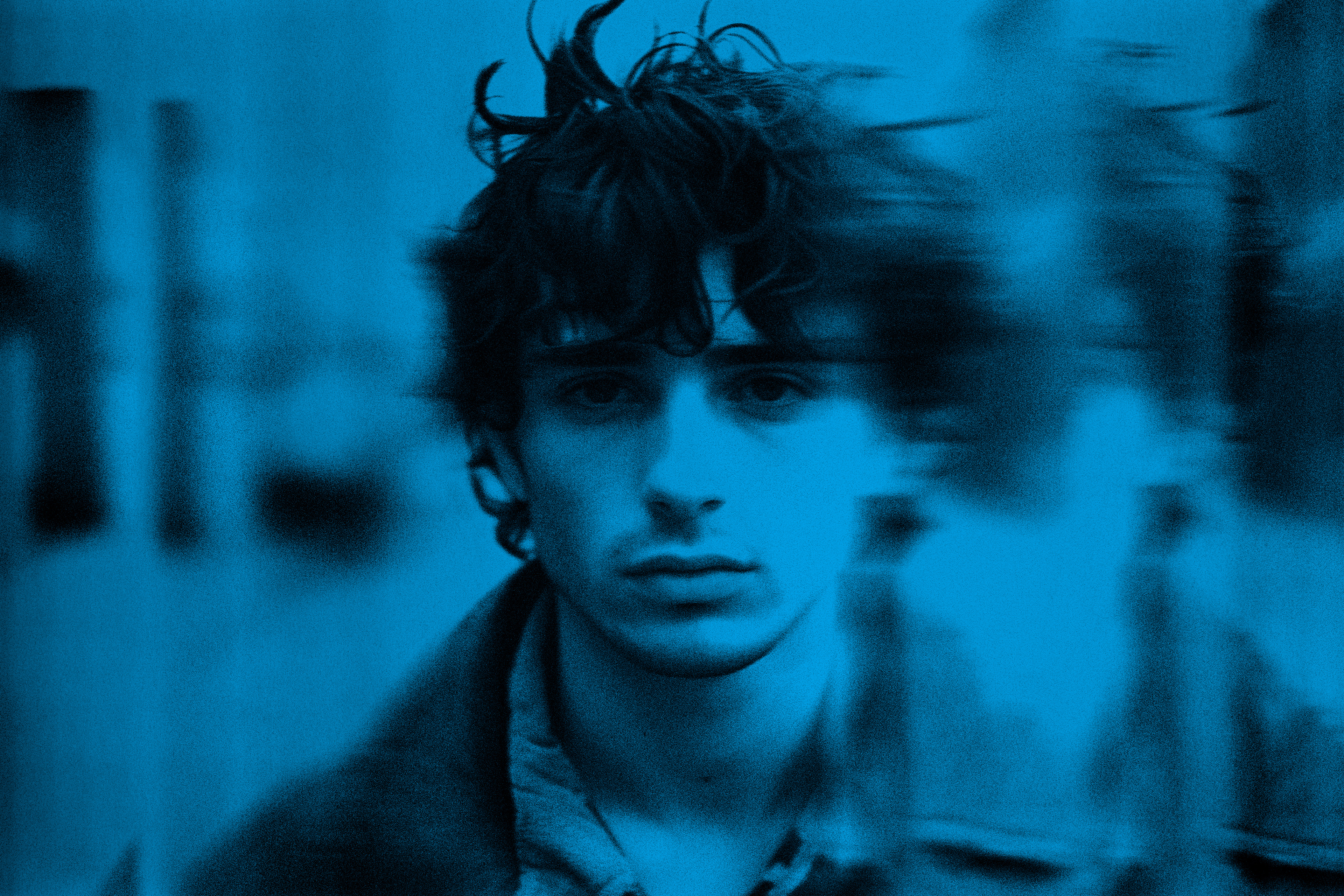
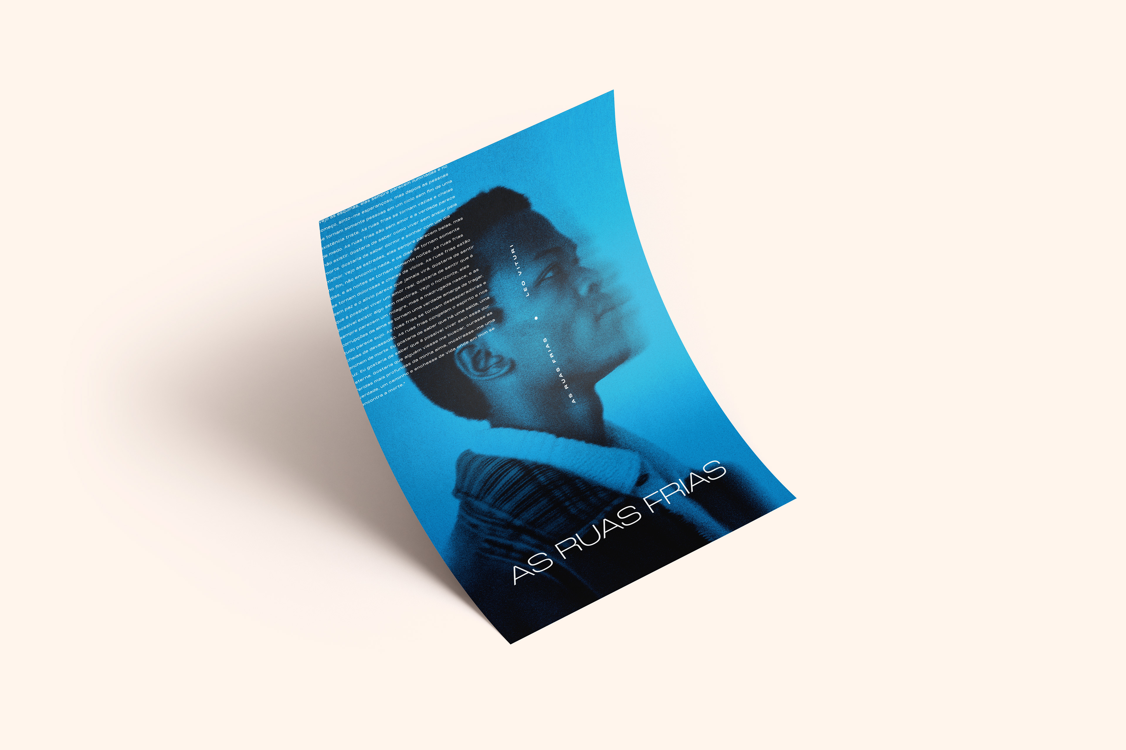
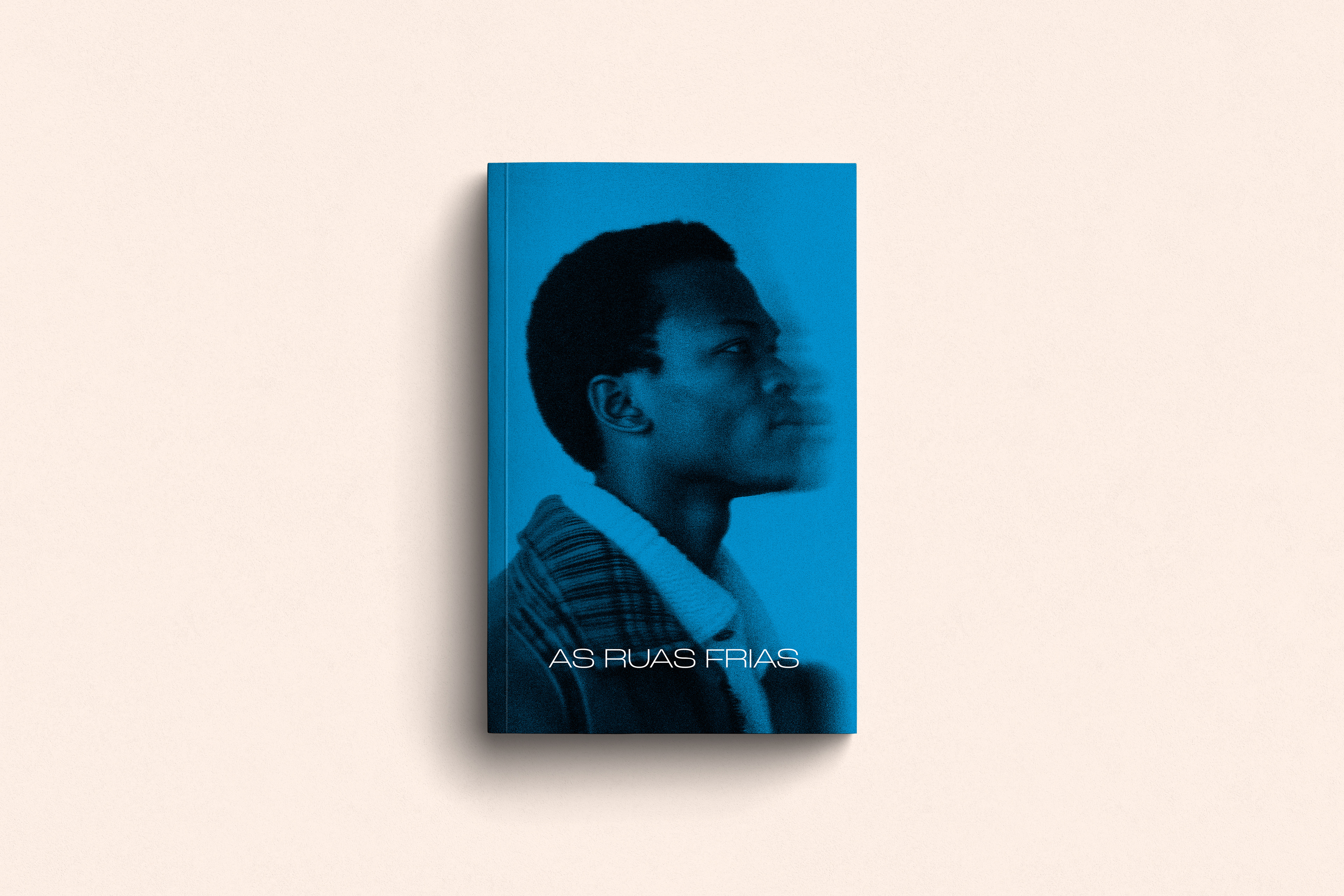
A cor ciano foi escolhida inspirada no padrão de cores CMYK, refletindo a história do personagem principal que trabalhava em uma gráfica. Foi nesse ambiente que seu sonho de se tornar escritor nasceu. Como está prevista uma trilogia, as continuações serão pensadas nas cores magenta e amarelo, completando a paleta CMYK.
As fontes foram selecionadas para transmitir uma atmosfera moderna e jovem, refletindo o cenário urbano em que o livro se desenrola. Elas capturam o dinamismo e a sinergia com a cultura pop, inclinando-se para uma perspectiva underground que ressoa com a energia da juventude.
_________________________________
In the book "Harsh Streets", the physical descriptions of the characters are intentionally limited, allowing them to be imagined across various ethnicities and nationalities. With this in mind, the graphic materials for the publication and promotion of the novel were created to reflect this diversity, providing space for broad representation.
The personas' images were generated using MidJourney, an artificial intelligence tool, and later refined in Photoshop to achieve the desired aesthetic.
The color cyan was chosen, inspired by the CMYK color model, reflecting the story of the main character who worked in a print shop. It was in this environment that his dream of becoming a writer was born. Since a trilogy is planned, the sequels will incorporate the colors magenta and yellow, completing the CMYK palette.
The fonts were selected to convey a modern and youthful vibe, reflecting the urban setting in which the book takes place. They capture the dynamism and synergy with pop culture, leaning towards an underground perspective that resonates with the energy of youth.

A versão final do livro foi diagramada no InDesign, com escolhas gráficas pensadas para reduzir os custos de impressão, resultando em uma versão em preto e branco, sem imagens. No projeto inicial, os parágrafos seriam diagramados alternando entre a esquerda e a direita, para dar a sensação de movimento pelas ruas.
Na versão final, essa ideia foi abandonada. No entanto, em uma versão mais luxuosa, essa perspectiva poderá ser retomada.
_________________________________
The final version of the book was laid out in InDesign, with graphic decisions aimed at reducing printing costs, resulting in a black and white version without images. In the initial project, the paragraphs were to be arranged sometimes on the left, sometimes on the right, to give the sense of walking through the streets.
In the final version, this concept was set aside. However, in "deluxe" version, this perspective may be reintroduced.